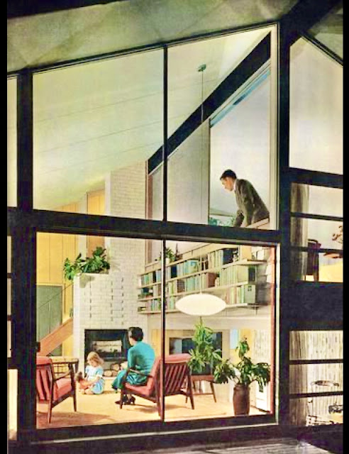
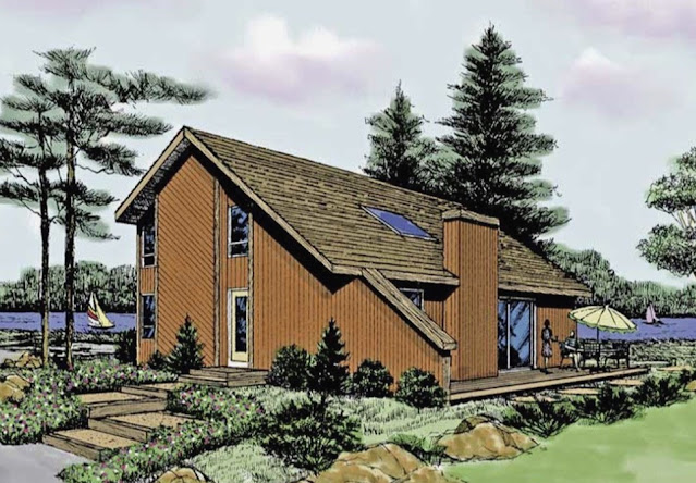
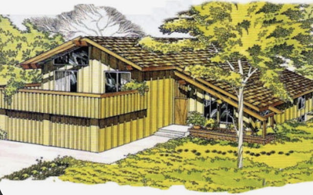
Often these preserved gems pop up on MLS and depending on the area can be surprisingly affordable. Most haven't been updated since they were built 40-60 years ago. Ever since I was a kid I have enjoyed the rich, darker Earth tone palette and use of natural substance like exposed wood beams and paneling, flagstone look floors and stacked stone fireplaces, brown, green or orange shag carpeting, lots of plants and planters and floor to ceiling glass walls and clerestory windows to let the surrounding foliage and sky inside. Here are some prime examples...
The ubiquitous globe light
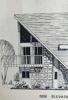
Side balconies, recessed entryway and carport
Citrus colored doors pop in a monochromatic, Mondrian inspired facade.
Clean, simple lines let the flower beds and flower boxes be the focal points.
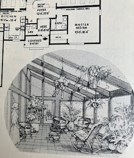
Contrasting beams soar above a voluminous great room. The perfect artwork: a glade of trees just outside...
Wow, stone, space and modern light fixtures blend well together
Generally, a carport is better suited, but here is the garage version:
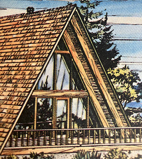
The 1978 Barbie house was unofficially dubbed, the "A Frame" house, but you can see it's a misnomer. The owner of this house bought a fantastic mid century modern home and gave it the trendy (for now) farmhouse cottage look with 1980s country blue, all they need now is the little ducks on everything. Hopefully, some hip owners will restore it back to what it was always meant to be: space age atomic modern with cool crisp colors and a citrus or turquoise colored door and modern light fixtures. Plus a little but of landscaping would be nice...

These 60s houses usually had 50s style hardwood floors which can be refinished light, dark, or my favorite middle tone of "American Walnut". Avoid sectional sofas that suck up the entire room and limit other furniture placement. Loungers with ottomans are just as comfortable and can easily be moved about to suit the occasion. This room could use hanging lights to clear up more space for guests to move about. Staining or painting the beams and window trim would add much needed sharp contrast for added visual interest. Including a rug would cut the glare coming in from the window light and absorb sound so as to avoid any echos. If they put the sofa on the other wall, then a large, impressive, modern (think Pollack) work of art could be hung on the larger wall over the sofa. When you only shop at Ikea or Target the result is very bland and common. These old houses deserve better. Shop local and online retailers that specialize in mid mod items. You'll be glad you did, and your guests will be very impressed.

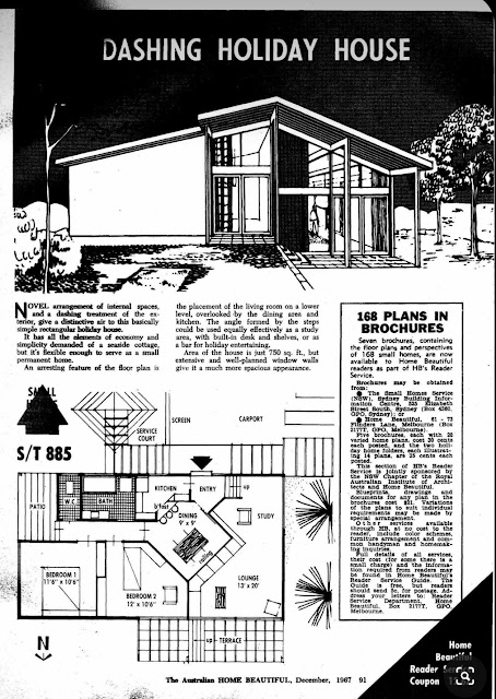
I'm sure any builder would be happy to custom build this vintage plan for you.
1970's Fab Chic "Blob" sofas:
Meanwhile, in a high end design store in 2025, the diagonal slats live on:
What a real life upstairs center piece would look like today:
Post Modern Dystopia: A Frame Townhouse Tract Ruins ~
This is the "Sky Lounge" in a condo building. I was enjoying myself here, looked up and thought, "Hey, this reminds me of the A Frame house floor pieces and white columns". It's funny feeling like you are inside a life size A Frame toy house.


.jpg)








.jpeg)


